Twin Pops is a family owned business who has been in the water ice business since 1989. They ensure that everyone has access to a refreshing popsicle with the affordability and accessibility throughout many stores.
Approach
Revitalizing Twin Pops provided us with the opportunity to engage with the established community, infusing a sense of togetherness through the choice of a single, resonant word: "Sweet." This approach allowed us to explore the various meanings through this one word, enabling a seamless integration across our brand narrative.
Problem Discovery
With twin pops being able to come at an affordable price to many consumers, the evident problem was the market that this company was competing in. Many companies have made their popsicles with natural ingredients or come with a smoother taste, but twin pops has remained consistent when it first started, and it was clear that this company needed a rebrand to keep up with the competing market.
Market Scope
The competitors in this market portray themselves as either having healthy ingredients that is marketed towards the older audience or sweet and fun for children. The main takeaways towards these competitors was that there is no company in the affordable range marketing towards adults and there is little to no interaction from the company to the customers themselves.
Branding
A Sweet Tagline
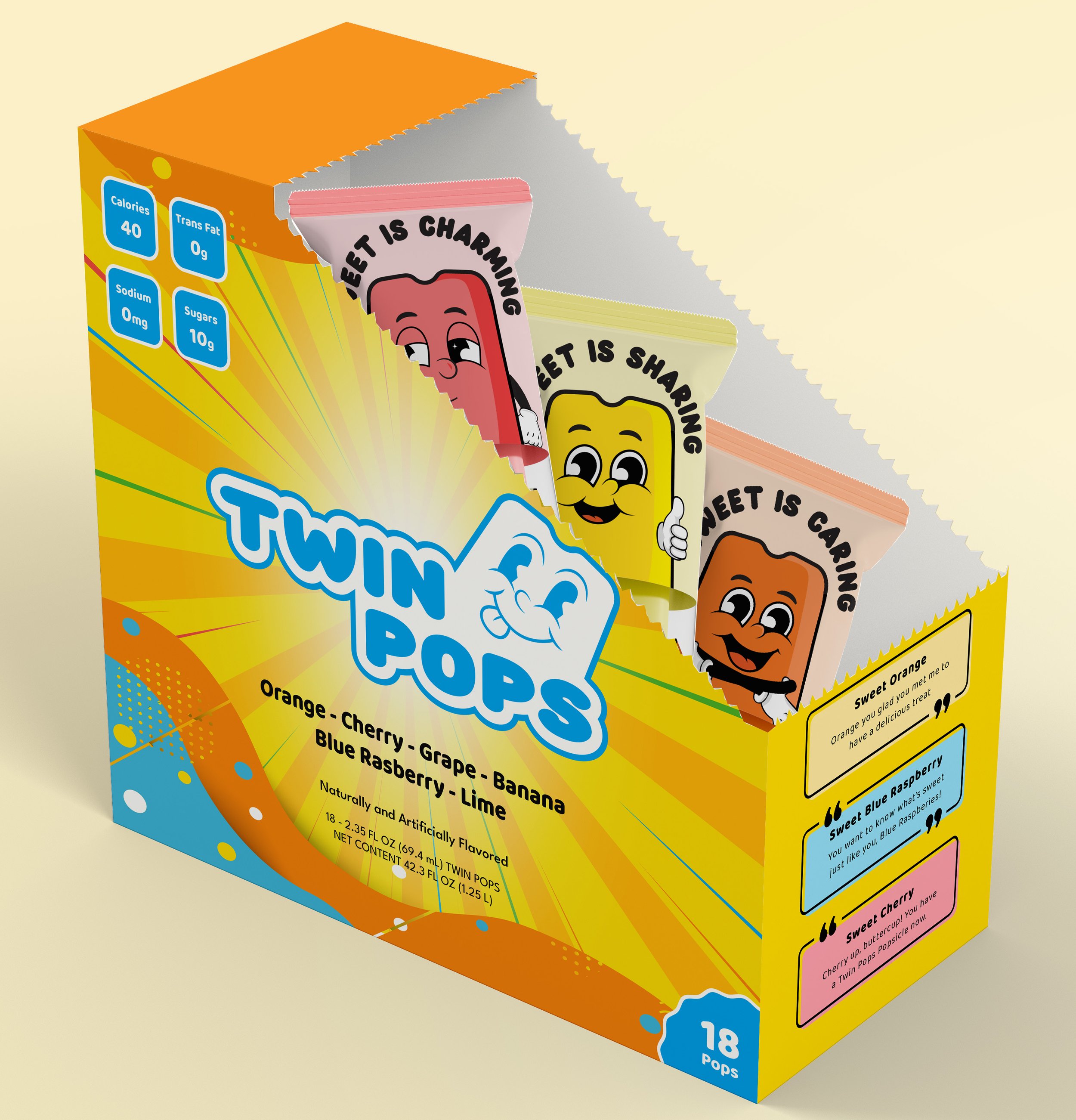
When trying to encapsulate what makes Twin Pops special, we found that “Sweet!” said it all. It can be a comment on the taste, as well as a response to a question. “Sweet” can also be speaking about a kind act performed by someone.
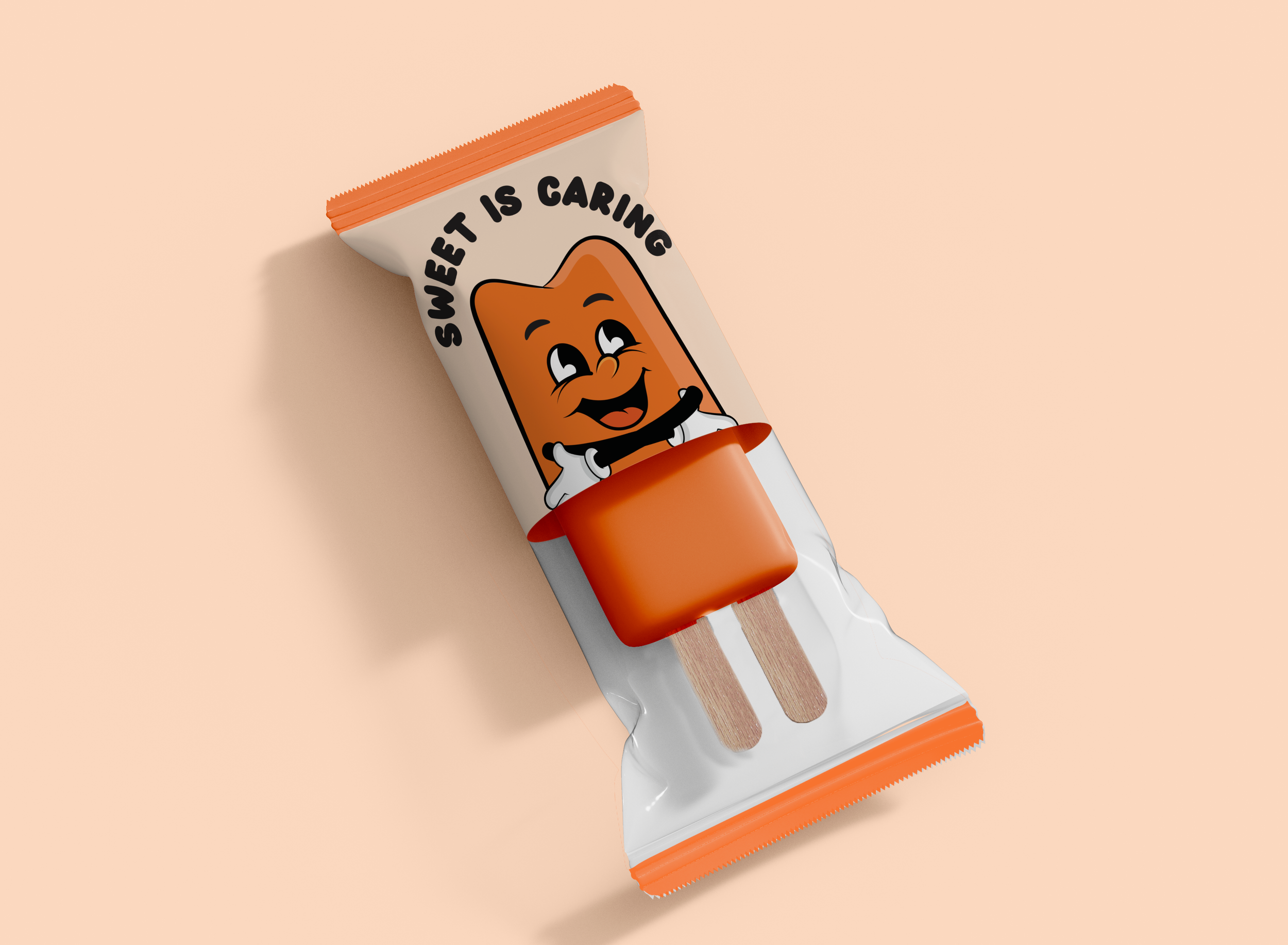
Illustration Style
With expanding the sweet tagline, we wanted to bring in a fun character called Mr.Sweet, and this character would be able to exemplify all of the different meanings of what sweet can mean.
Touchpoints
Social Media
We created a campaign that imagined all the ways that “Sweet!” could be used as a response for questions relating to Twin Pops. Designing the physical word Sweet as something colorful and fun sets the tone for the campaign. We also used a consistent image style that has a similar tone of warmth and happiness. Both things are to remind the audience what it’s like to eat a Twin Pops.
Random Acts of Sweet
Our social media platform acts as a unveiling for the introduction of our "Random Acts of Sweet" award. This distinctive recognition is crafted to recognize the heartfelt actions of individuals within the community.
The uniqueness of our award system lies in its inclusivity, inviting our audience to nominate individuals who've showcased sweet gestures, whether that be grand or small gestures. Our goal is to inspire everyone to embody the spirit of staying sweet on social media.
Website Approach
To stick with the personality of Twin Pops, we wanted to make the layout of the website more fun and interactive. This was done by presenting our overall message in the beginning, while also including fun elements such as Mr. Sweet and including the winners for "Random Acts of Sweetness".